Harry Winston
Harry Winston was looking for a total redesign of their existing online presence. As Creative Director on this project, I was delighted to partner with the Harry Winston team to bring this experience to life. My role involved initial competitor research, user experience testing, harrywinston.com design and complete visual updates including new photography art direction. UX Partner: Rainnie He. Visit Harry Winston

The Problem
Harry Winston had a quite outdated website. They were not showing the products in the best light, and they were not showcasing the decades of historical photography nor the rich history of the brand. Additionally vital services like booking appointments were clunky and under-utilized.

The Solution
Bigger brighter photography of the jewelry helped show off the true intrinsic value of a Harry Winston piece. New product detail pages told a fuller story and helped the viewer better understand collections. New dedicated pages like Appointment Booking and Locations helped drive sales.

Early Mood Board
One of the first mood boards I made for the Harry Winston team to illustrate the relationship of the brand blue and my intention to open up more white space in the overall design.

A/B user testing - Color
In order to make the very big change from the dark blue background to a white background I set up a user test. Results were shared with the Harry Winston team, and we were able to agree on the new off-white background for all product shots. We backed up our recommendation with thorough competitive analysis.

Results of testing
Once we got past the results of testing and were able to convince brand stake holders to showcase their jewelry on the white background, we had much more flexibility concerning page layout. The above section from a High Jewelry Product Detail Page or PDP shows off all of the new opportunities from variation in typography color to produce greater hierarchy of messge to elegant ghost buttons.

The Studio
A space where we kept all design thinking on all four walls during the one year duration of the project helped us stay organized and inspired.

High Jewelry PDP
The High Jewelry product detail page was designed with unique needs in mind. These are the pieces that could very well sell upwards of fifty million dollars. It’s clear why they need a very special page showcasing the craftsmanship and beauty of each one of a kind piece above price or any CTA. I chose to feature a single shot of the piece with only the title and collection name “above the fold” with details and editorial photography to tell the entire collection story following.

Collection Banner
Designed to represent the collection from which the piece came from and encourage the viewer to view the entire collection on a Collection Page.

High Jewelry Collection Page
A High Jewelry Collection page was designed a bit differently than say, a timepieces collection page. This design is to place the very highest value on High Jewelry. Each Collection leads with the most important piece taking up a full screen section with a brief description and CTA leading to the PDP. Below are smaller components for the other pieces in the collection.
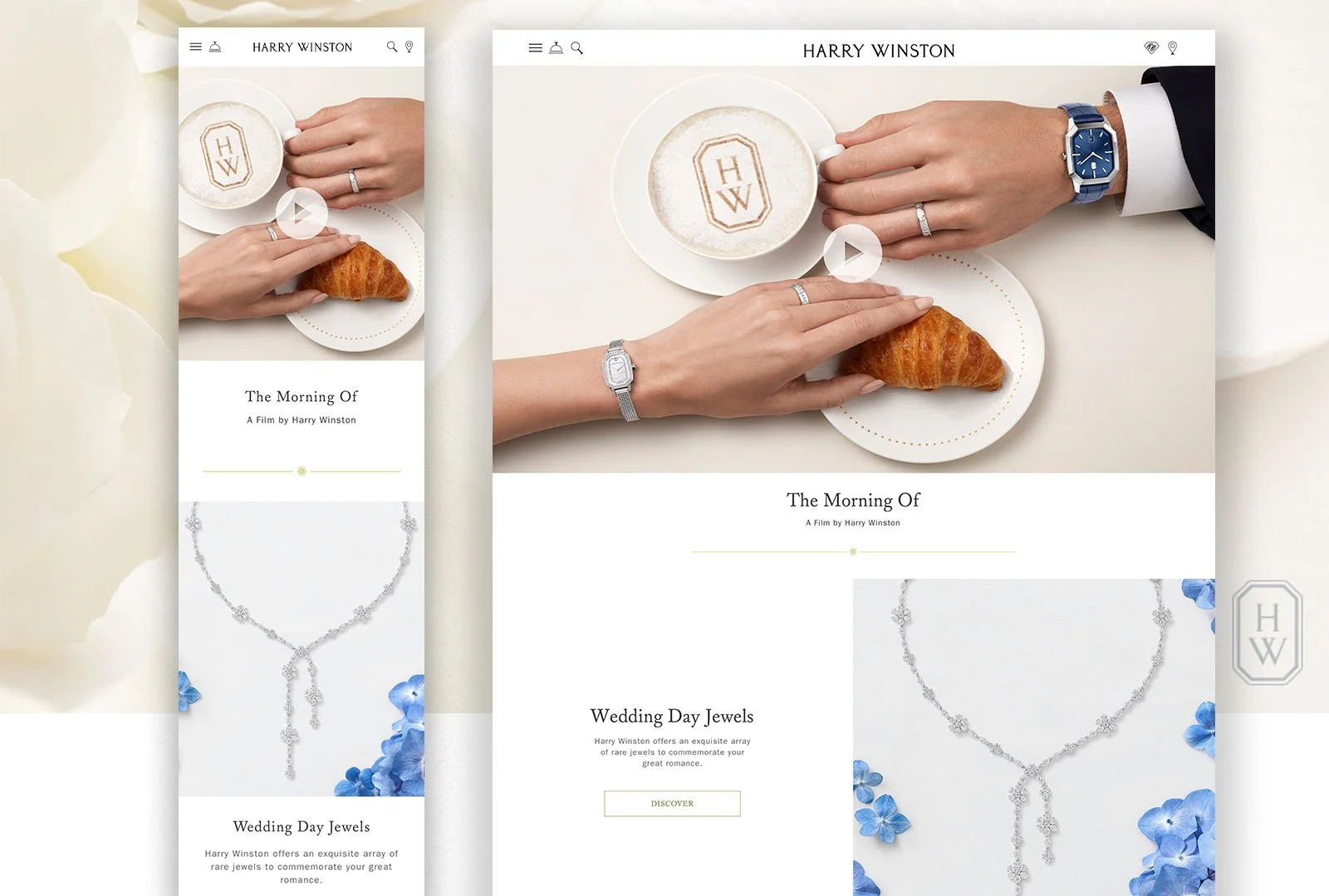
Mobile


Branded Icon System
I designed a new icon system inspired by the Harry Winston logo. Noting the serif on the font, I chose to apply it to each icon in the most suitable and creative way. As an example, the service bell icon has the serif worked in to the top portion, and the search icon has the serif design on the handle.

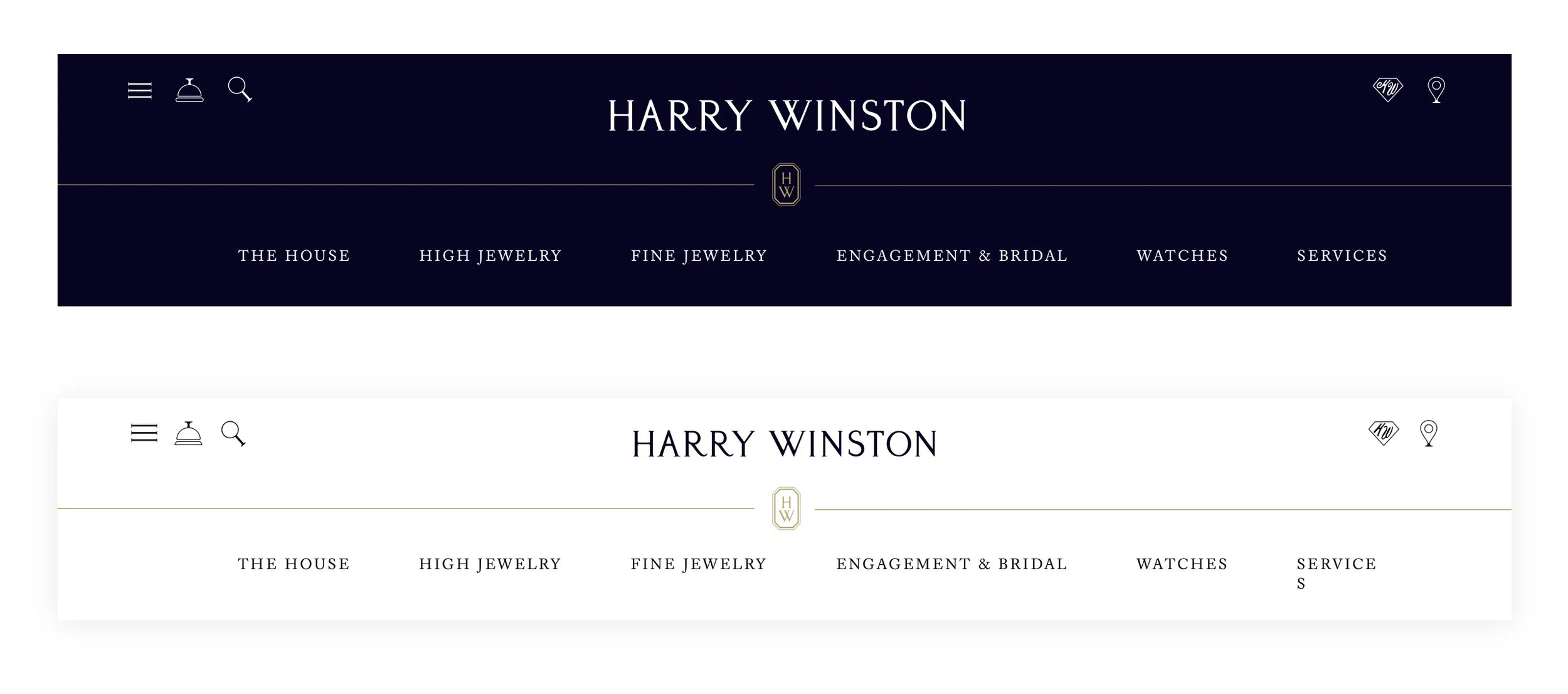
Header Design
Above you can see the new header design. I created an animated header that collapsed upon scroll. It utilizes the sleeker new icon system and moves contact to a more appropriate location on the site focused on appointment. booking.


Designing the Timeline
The updated Legacy Timeline (above) is designed to share the complete history of Harry Winston. For this I dug through the vast photo archives to put together the date, story, and image of key events in the company’s history. The viewer can click or drag the timeline to the left on desktop, and swipe left on mobile to move through events easily to learn the total legacy of Harry Winston in one place.

Designing the Timeline ll
User testing findings on existing timeline:
Lengthy- Users do not want to scroll through such a long timeline. Photography style is not consistent and makes for a messy layout Dark blue background confuses the intention with certain photographs and does not have a “luxury” or modern feel.


Brand Legacy
Additional components designed to support brand legacy throughout the site.
Engagement & Bridal Landing Page
For the most important area of the site as far as revenue, I created a new, more flexible design with a widescreen video component allowing for title and description below. I added new areas that can be used to link out to more content such as a featured bridal jewelry page.

Engagement Product Filtering
Wire frames on the left. below On the right is the final design showing the product hover state with a carousel of product images, title and brief description. Engagement rings can be filtered by shape, material, size.
Engagement Search
I proposed a mosaic grid system that featured special products, in this case a couture one of kind engagement ring.


Campaign Page - Holiday
An important challenge of this redesign was being able to build gorgeous editorial pages for campaigns such as a new collection launch or a Holiday Gift Guide while working with the framework of the Sitecore SXA limitations. To pull this off I designed flex-able components such as editorial style quotes, full screen story telling carousels, and areas for longer form text with editable hex code backgrounds to suite the campaign. I created new photo com-posits of holiday work to show how these new components could be combined in an endless array to achieve any kind of campaign that may arise in the future and look stunning on any device.

Client Service Wireframes

Client Services
One of the most important features of the site is for a viewer to have the smooth ability to make an appointment and view the piece in person at a Harry Winston salon. HarryWinston.com is not an ecom site, so a salon visit and a new customer relationship is vital to their business.
Photo Direction
In order to ensure consistent photo for the Harry Winston team years after I finish the project, I created an entire photo direction site optimized for iPad with examples of every shot needed for every product and text description. This is the best view for folks working in the studio arranging and shooting product shots and lifestyle shots to have the direction close at hand.

From the Style Guide
Below is a sampling from the Style Guide created for Harry Winston. Mobile and desktop typography guides create a cohesive responsive look and feel. Color and new components give the experience a fresh reproducible guide to follow.

Thank You
Why not end on something beautiful!
With a whole new photography style, brilliant new ways to showcase products and a simplified way to book appointments we were able to give Harry Winston a look and feel that this legacy brand deserved!
