The story of an EdTech brand…
In 2020 I stepped into a company that excelled at creating and curating top tier educational content and getting that into the classroom, but had not yet taken on how they present as a single brand with their own look, feel and language.
In order to revamp everything from the UX of lessons themselves to the brand colors, type and animated DE Characters I built out the creative team that would ultimately give Discovery Education advantages we had never dreamed of in the EdTech marketplace. I must emphasize the work represented here was a team effort created by many wildly talented folks.
Here I will show how the brand has been reimagined over four years and how it is currently applied to AR apps, digital lessons, physical products and packaging, books, interactive gaming, teacher dashboards, video series and much more. View our system and meet the team: design.discoveryeducation.com

It starts with a design system- type, color, photo, voice, soul

part l
The DE Characters
•
The DE Characters •

Why Characters?
We created the cast of characters to help kids feel connected, welcome and joyful while using DE products. Characters make Discovery Education more appealing and delightful for students. This personal engagement enhances learning. Follow along below from the first sketches and user testing through fully realized 3D rigged models ready for animation.

Initial first sketches of Victor created to get the pose and expression right through to final rendering with textures and tummicon and motion capture animation test.

Sketch and Test
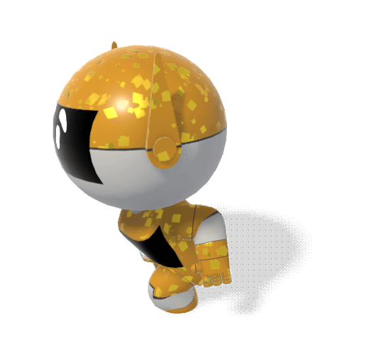
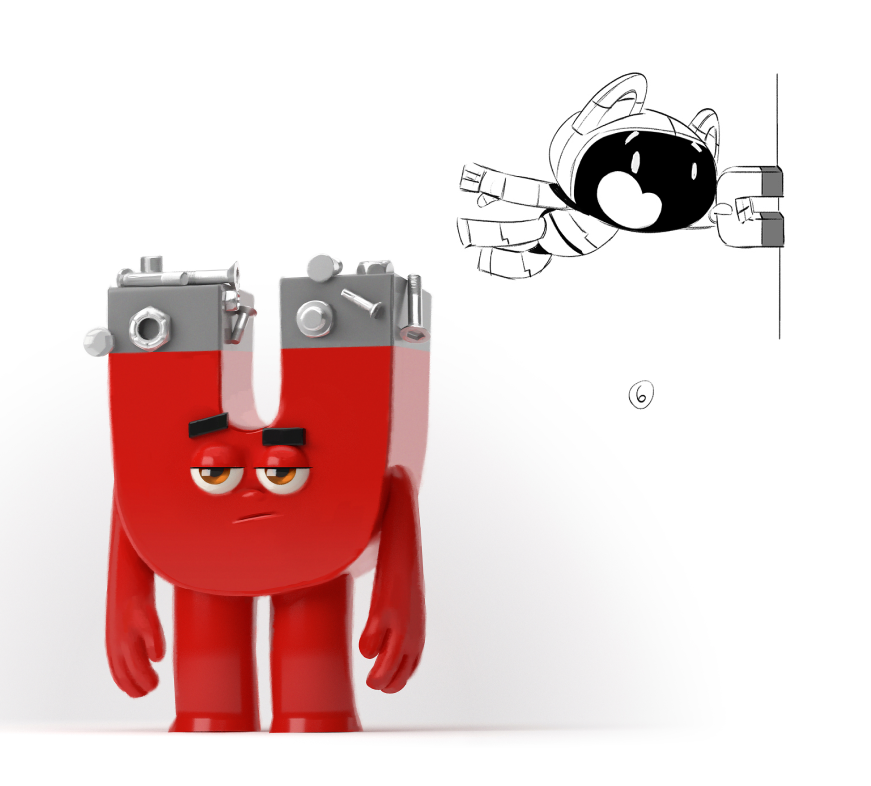
We spent the first few weeks working with Character Artist Felipe Hansen trying everything from tardigrades to magnets to robots. Next we tested the sketches with over 1,000 students grades K-12. We found robots skewed to girls, inclusion was appreciated, expression, props and details play a large role in perception and should be used intentionally. After reviewing the readout with our UX Research team, we decided to go for a crew of robots with varying ages and interests. Research Credit Bre Abo.

For many weeks we just had Felipe, sketching and testing every possible kind of character- robots, mice, insects, even astroids! It was the most fun to just be in a pure play space of our imagination and then get to test it out with kids and see what worked!
Testing in Product
Using a very rough & loose wire frame approach, we tried out our characters at various stages of fidelity within our digital product. Below you can see concepts from animated test tubes within our original video content to the rewards and gamification of math lessons.

Above you can see us testing out the very first Characters within learning games, on a 404 page, introducing a potential video series and embedded in to a core company product called Techbook.
The agility of a small team within a large organization allowed us to react quickly to feedback. This made an under-explored area of the brand identity incredibly strong.

Form
In reaction to feedback that Zoe’s form portrayed an unrealistic view of a young female body, we worked with Felipe to get the perfect shape. As part of our research we were drawn to the athletic forms of girls like Simone Biles, Sue Bird and Megan Rapino. This fit well with Zoe’s narrative from the Character Bible that Zoe is a dancer.

Color Explorations
We received feedback that the all-white material of the characters could be perceived as an all-white classroom. In other words there was a lack of diversity. After reaching out for many internal conversations within our company, we brought Felipe back in to work on adding color to our DE Characters. Here are a few of many, many explorations.
Get to know the DE Characters below and explore the rules of usage outlined in the Character Bible:


3D and Beyond
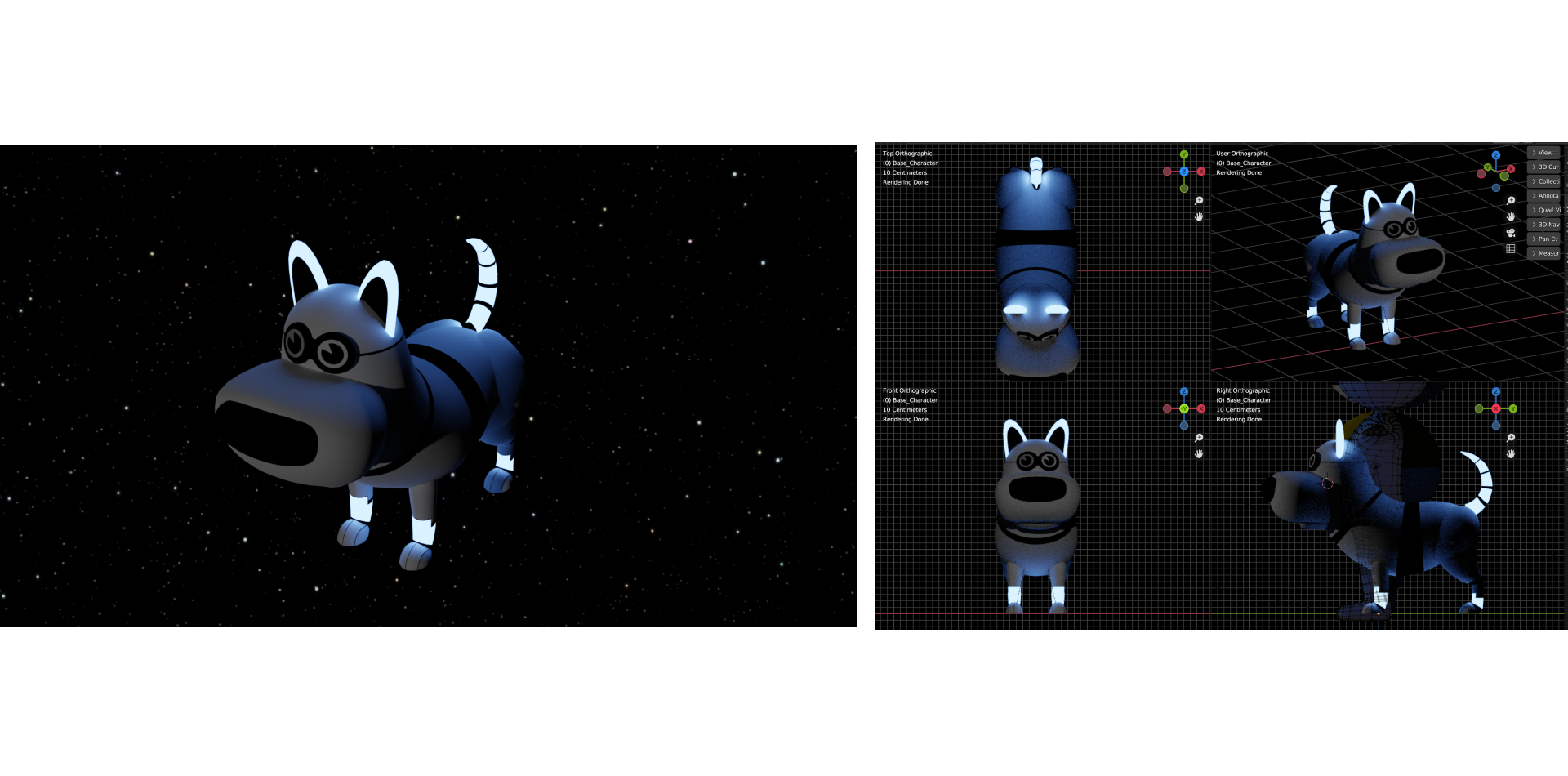
I knew from the first sketch that the DE Characters would ultimately be realized in 3D. I chose 3D years in advance knowing we would need efficiency in production and cost, but never could have pulled this off without our incredible team. Weiwei Zhou creates the rigged models in New York using Blender while Phil & Dan Birchinall in the UK handle surfacing and Unity animation.
Explore the 2D-3D process below:

Lorem Ipsum this is a caption


Below you can see the style we use of 3D models combined with 2D elements:


The DE Characters in Product:

Victor helps you build a plant using the key parts of roots, trunk and leaves in this interactive learning game titled Response to Environment.

The Channel Banner for the Social Studies Need to Know video and Ready to Use Activity series features Zoe using an historic camera and Victor in Civil War era hat. Design by Weiwei Zhou

For the Social Studies Need to Know Activities, Zoe and Victor dress up in various period clothing with appropriate props to help tell the story. Design by Weiwei Zhou

Eduardo and Mei help emphasize the activity of reading and writing and lend a cozy soothing atmosphere to this page layout for young writers.

The Discovery Education’s 404 Page is an animated scene of Victor in his space suite bobbing gently in space far above the earth.

Packaging for the DE Science Kits materials feature labels with the DE Character that is suitable for each grade band.

DE Money is printed and used in the classroom for math lessons. Design by Weiwei Zhou


Hands on Activity “Recipe Cards” and a shopping list created for teachers to help them prepare to teach a classroom lab activity. Design by Alexandra Corona

Hands on Activity “Recipe Cards”created for teachers to help them prepare to teach a classroom lab activity. Design by Alexandra Corona


Teachers can select from premade scenes of the DE Characters to label their various classrooms in the Classroom organization area of Discovery Education.

The Career Connect app connects professionals in the field to classrooms where they can give an overview of their career path. The DE Characters help you book an appointment.

Avatars are available on the My Profile page. Here is is view of the Profile Panel featuring Mei.

A page where the teacher manages her classrooms and can choose colored backgrounds with DE Characters to represent each class.

Disco livens up the homepage of the 4th grade learning app.
part ll
Typography
•
Typography •

A Custom Font Variation
Midway through my time at DE, it was brought to our attention that the Proxima Vara we inherited and were using for all students was not appropriate for all ages. Additionally, not having a font for early learners would hold us back from certain large parts of the global market. We set about to design a customized font variation that is made to replicate characters exactly as children are taught to read and write in the classroom.

Mikado-chan is a customized font designed for the way young learners are taught to write and read in the classroom.
Discovery Education owns the exclusive rights to
Mikado-chan, a variation of the existing font, Mikado.
Mikado (帝): King or Emperor
Mikado-chan (帝ちゃん): Little King or Child King
Designer: Hannes von Döhren in collaboration with our Sr. Designers Joyce Tai-Chau and Alexandra Corona
Below you can click through to see the documentation around usage in the DE Brand Book, and see how the font is applied within the DE app for grades K-2.

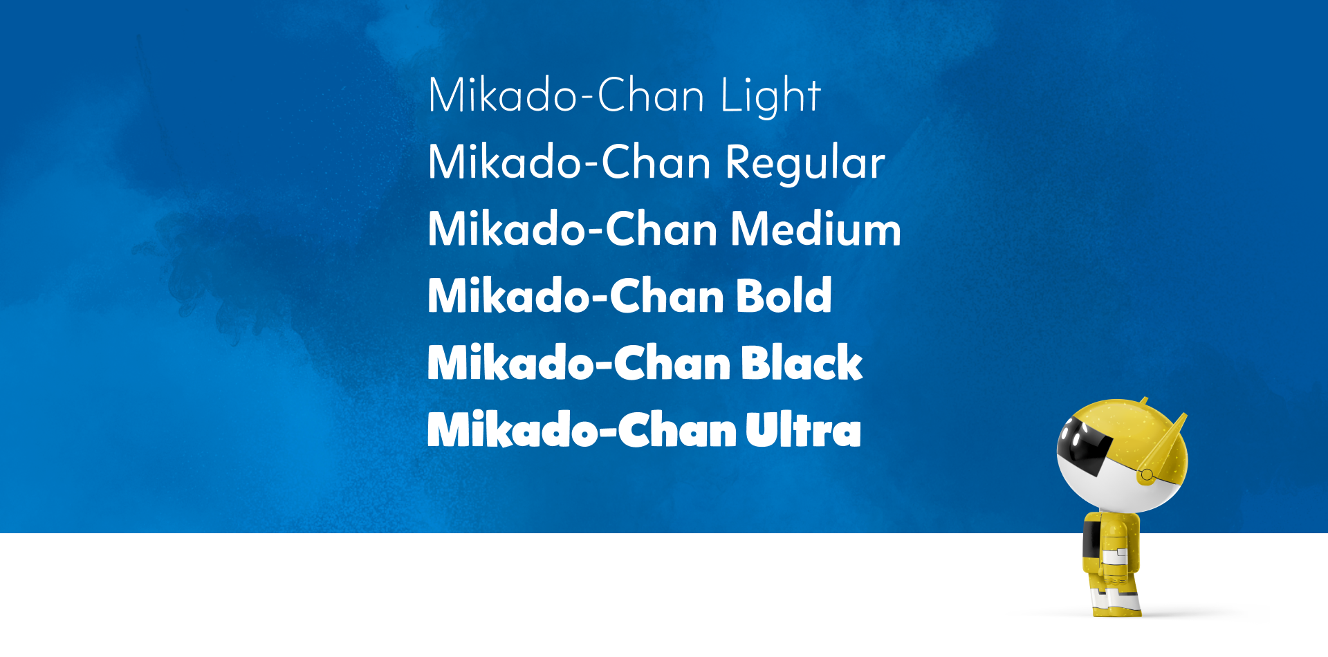
Available weights for Mikado-chan

Recommended styling for Mikado-chan within digital product

On this “I can” slide template for grades K-2 Physical Science, you can see Mikado-chan in action with the H1 and paragraph.

In a first grade text book we always use Mikado-chan. It is the only font that meets the needs of early learners for reading and learning to write. Designed by Joyce Tai-Chau

Sound All Around is a popular interactive learning game which utilizes Mikado-chan for children grades Kindergarten through second grade.

In this materials list within a Kindergarten lesson, we always use Mikado-chan. It is the only font that meets the needs of early learners for reading and learning to write.

Mikado-chan is used here as an accent font for the DE Science Kit packaging. Because the packaging itself is teacher-facing, it’s fine to mix Mikado-chan and Proxima Vara. Design by Alexandra Corona

In a Kindergarten lesson, we always use Mikado-chan. It is the only font that meets the needs of early learners for reading and learning to write.

Mikado-chan is used for all first grade work books. It best replicates the way students are taught to read and write. Designer: Joyce Tai-Chau
Below you can view the requested updates to the font to get it perfectly suited for the lower grades:


part 3
Color System
•
Color System •

The Color System
The color system for the Discovery Education platorm is incredibly nuanced. The interface colors are neutral only using the brand blue for interaction. This allows our colorful content to shine.
As for the content, we needed primary and secondaries for each subject matter in addition to consideration for grade bands and sub-libraries for specific subjects like Science which breaks down further. I chose to move the company away from the desaturated tints and shades they had been using to a system that included enough variety for our designers to achieve every scenario, but highlights the fully saturated color that should “rep” the subject matter.
Brand Blue
Write here how this is our Brand Blue, how it’s represented in Product Design and how we have many services and products in our DE.X Try to explain how it’s meaningful to our Brand, but what purpose it serves in Product Design. Hoe one shade darker is used in our UI Design. What Blue means to us, how it’s a refresh of the Discovery history colors, ect. 800 Passes...


Card Example
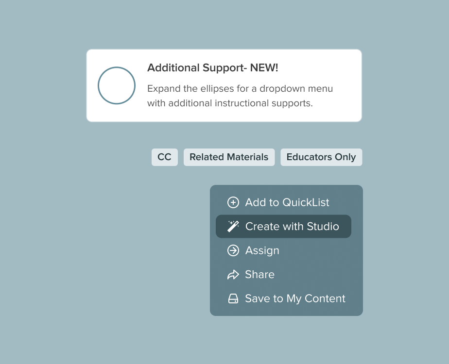
In the above card example previewing a Need to Know lesson, the Interactive blue is used the the elipse- the one action we want the user to take.

Two UI Examples
In the two above components from our Nebula Design System, Interactive blue (or Brand Blue) is used on an element that in clickable or tappable.


Neutrals
For UI elements on our Platform, we keep our colors intentionally neutral. We use various tints and shades of black and muted blue.
The black and muted blue are used to keep things as neutral as possible so that the vivid colors and exciting content can shine and don’t compete with the user interface needed to navigate them.


Typography
We use Platform Neutral 900 for headers and Platform Neutral 800 for body copy as a general rule. You can read more about Typography and color in the Typography section of our Brand Book.
Platform Interface Examples
In the three examples above you can see how Platform Interface is used to construct the interface elements, but not indicate interaction.

View how every color palette is applied in product in the examples below:


Science Color Palette

Preview Thumbnails
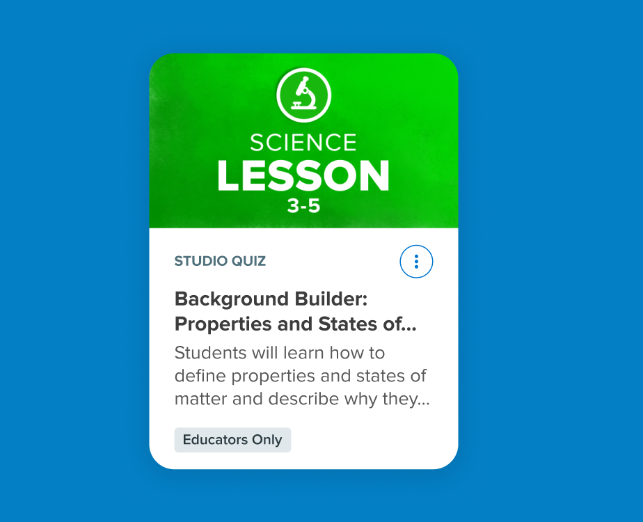
In the above example you can see the Science Gradient 1 used for the background of a Science Lesson Card to reinforce that it is a Science lesson at a quick glance before reading the card.

Science Color Examples
The above examples show off our Science color palette in use from the icon for the AR app Sandbox to the UI for our Science Interactive games within the DE app.

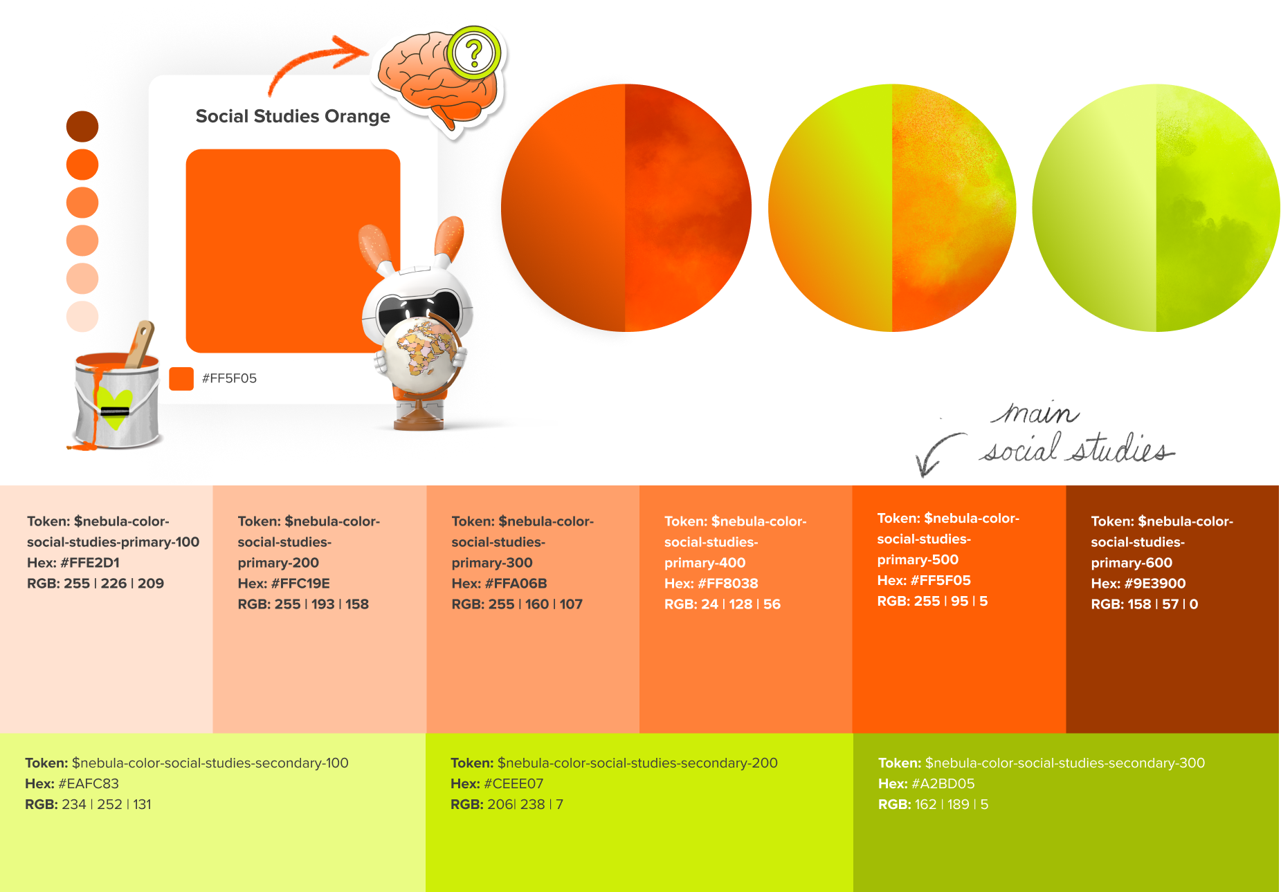
Social Studies Color Palette

Preview Thumbnail
In the above example you can see the Social Studies Gradient 1 used in the background shape on the card thumbnail for a Social Studies lesson and the neon green used in the torn paper highlighting the appropriate grades

Social Studies Color Examples
The text bubble above uses the Social Studies Secondary color palette with a green paper texture. Below are two Social Studies ideograms utilizing the full color palette with the majority orange and pop of the secondary color- neon green.

Math Color Palette


Math Card Example
In the above example you can see the Math Gradient 1 used in the background on the card thumbnail for a Math lesson and Math Primary color used in the icon sticker.

Math Techbook Curriculum Tile and Neons
Curriculum Tiles live on the homepage of our platform and lead to each separate product- here is the violet Math tile and Math colored Neon Elements.

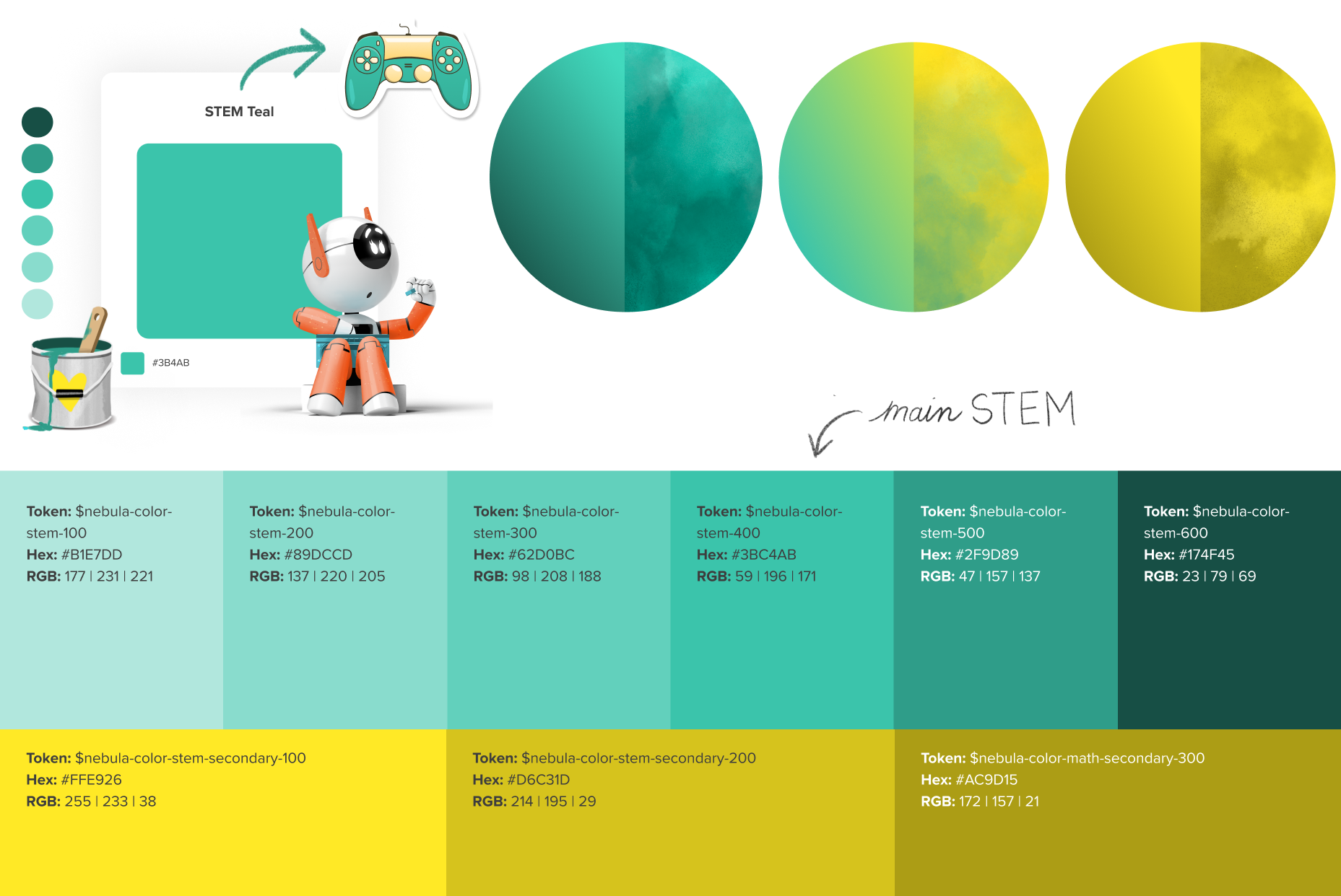
STEM Color Palette

STEM Illustration
The STEM teal is used in the above illustration. This example comes from a Hands on Activity lesson for designing a water filter.


STEM Icons
The above icons for Video, Read Together, Interactive Game and Hands on Activity illustrate lesson type and pick up the STEM teals.
Teach! Color Palette


Teach! Themed Card
This card from the DE Platform uses the Teach! Gradient 1 as a background on the thumbnail. This lesson teaches students how to use our in-house tool, Studio to create presentations, so the Teach! color theme is appropriate here.


Teach! Icons and Assets
Here is a variety of assets from a Play button to a “Product Tile” for a Professional Learning product that use the Teach! color palette.
Health Color Palette


Health Themed Card
In the above example you can see the Health Gradient 1 used in the background on the card thumbnail for a Health lesson and a Health Primary color used in the icon sticker.

Health Icons and Assets
Here is a variety of assets from a sticker icon to a “Product Tile” that use the Health color palette.
